THE BREAKING POINT
When the Most Dangerous Chart in the World Starts Moving Again

From Compression to Expansion
In March, we identified the U.S. long-term yield as the most dangerous chart in the world.
In a lengthy article titled THE MOST DANGEROUS CHART IN THE WORLD, published on march 23rd 2026, we warned investors about the consequences of a return of inflation and a sharp increase in bond yields.
At the time, the system was under tension.
Today, that tension is resolving.
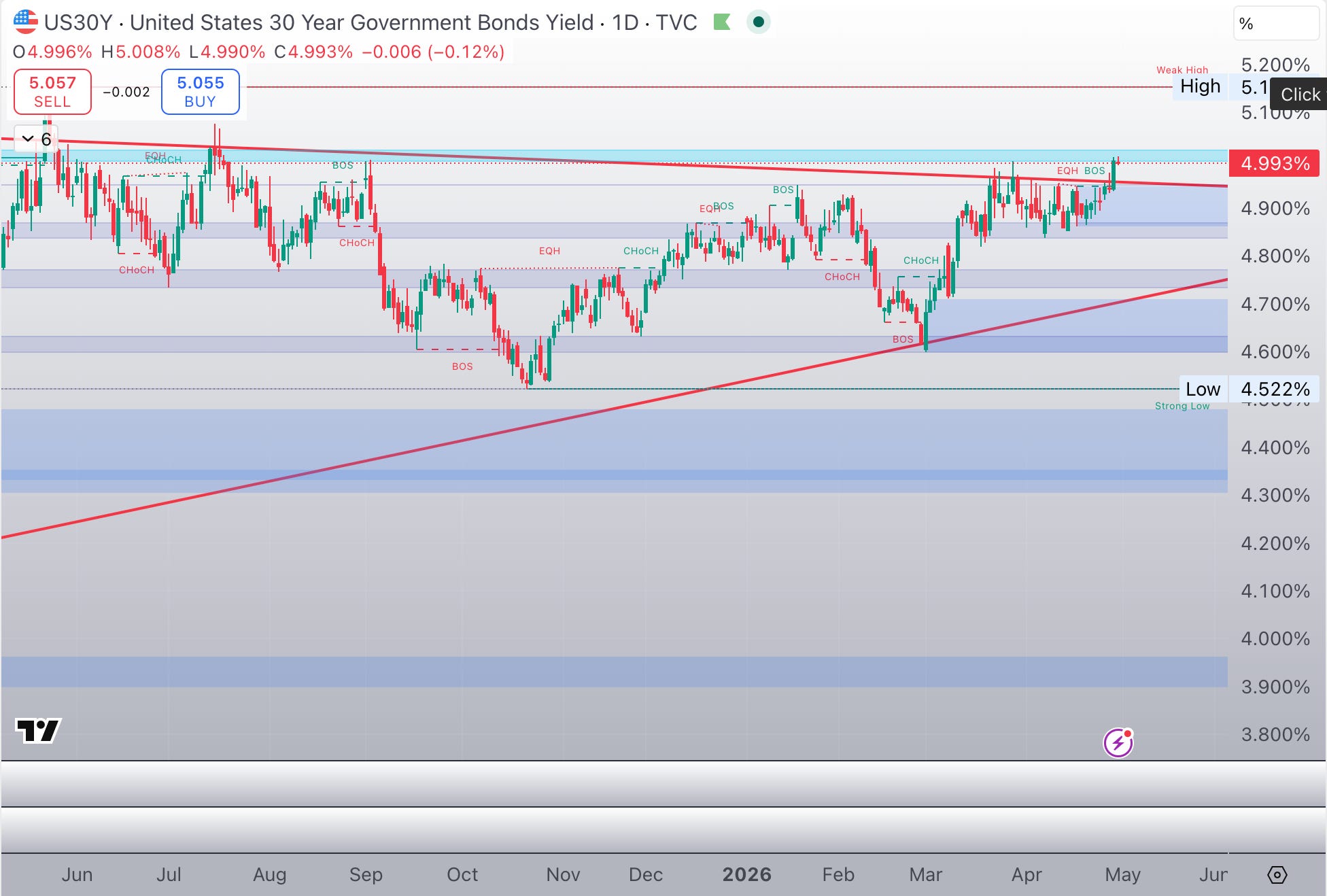
The US 30-year Treasury yield is now:
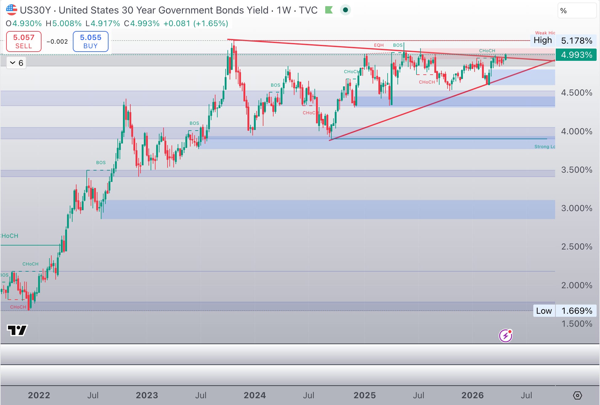
breaking out of a multi-month ascending triangle
repeatedly testing the 5.00%–5.10% resistance zone
forming a structure that typically precedes violent expansion
This is no longer a warning.
This is a pre-breakout condition.
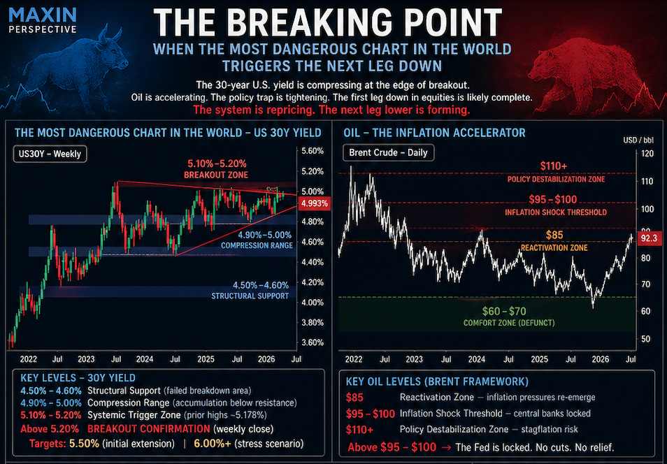
The Critical Levels — Where the System Breaks
Let’s be precise.
30-Year Yield
The above chart highlights three key zones:
4.50%–4.60% → structural support (failed breakdown area)
4.90%–5.00% → current compression range
5.10%–5.20% → systemic trigger zone (prior highs ~5.178%)
👉 A sustained weekly close above 5.20% = breakout confirmation
Triangles are continuation patterns by definition.
They develop after a sharp move, providing the necessary consolidation before the next leg of the pattern.
This triangle dating back to July 2023, comes right after the massive move in bond yields that ended the structural downtrend lasting since 1982
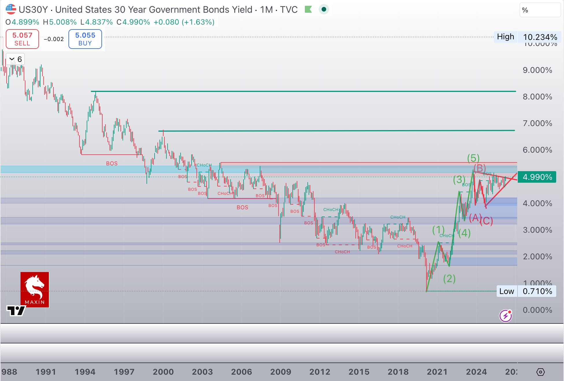
At that point, the breakout indicates the end of the consolidation phase and the next logical move is not incremental.
It is convex.
Targets:
5.50% (initial extension)
6.70% (stress scenario)
8.15 % ( completion of the long term A-B-C corrective wave of the past 30 years downtrend)
At those levels, the repricing becomes systemic:
mortgage rates send real estate in a downturn
banking system destabilises
public funding stress accelerates
risk assets premia reprice violently
Oil — The Catalyst Above the Catalyst
Now layer oil on top.
Oil is not just rising—it is reasserting itself as a macro constraint variable.
Key Oil Levels (Brent)
$85 → reactivation zone
$95–100 → inflation shock threshold
$110+ → policy destabilisation zone
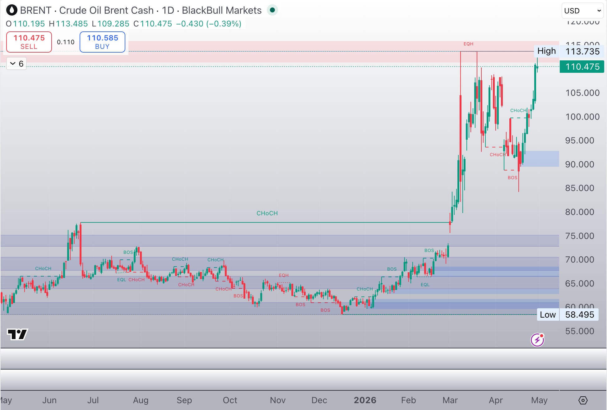
👉 Brent just pushed through $100 again, as tensions in the Middle East do not abate.
But the oil crisis goes beyond the straits of Hormuz now and it is far more damaging than investors believe.
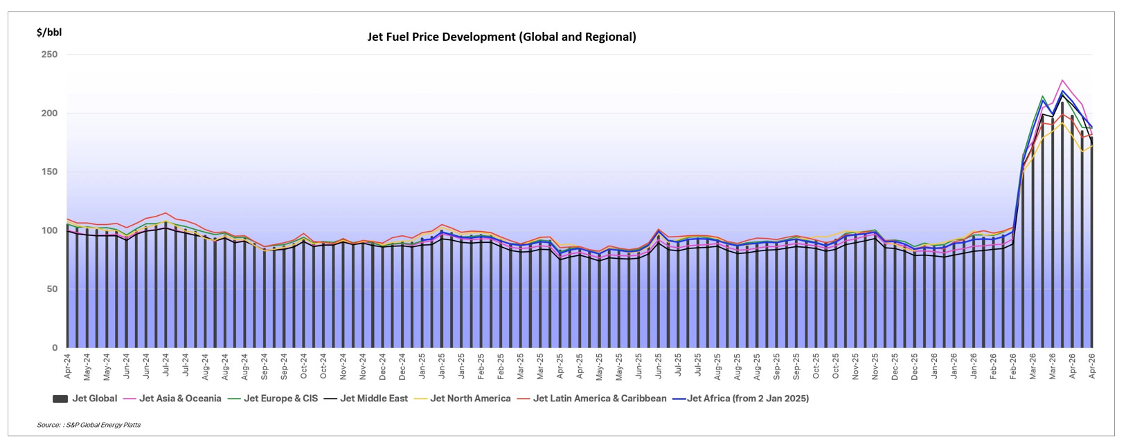
In the Us gasoline prices exploded to another new high for the year at $ 4.23 per gallon as the war in Iran has evolved from shock and awe to a war of attrition.
To force Iran to get serious about negotiations and force a regime change inside Iran, Trump is now committed to a longer blockade of the straits of Ormuz, effectively choking off the Iranian economy.
According to intelligence reports Iran has now only a couple of weeks of oil storage left and the dearth of financial inflows is pushing prices to the rook, with inflation up 67 % over last month alone.
It is only a matter of time before Iran agrees, but in the meantime it is a war of attrition for the whole world and the global economic damage is considerable.
But where it becomes highly uncomfortable is that even is the blockade was lifted tomorrow, it would take months for the very tight oil extraction-refining- shipping-consuming cycle to return to normalcy.
At these levels, the Fed is effectively locked.
No cuts. No relief.
Only passive tightening via bond yields to quash inflation
.
The Feedback Loop Is Now Active
We are now entering a closed loop:
Rising oil → inflation persistence → higher yields → tighter financial conditions → weaker growth
With the massive rally of the month of April, the disconnect between the behaviour of risk assets and equity markets and the macroeconomic prospects has become extreme.
The US economy is in a full fledged K-shaped economy where the rich are getting richer and spending like it is the 1920’s all over again, while the lower and middle classes ( 80 % of the population ) are struggling with debt, low income growth and extremely negative sentiment.
Equity markets are gyrating wildly following every tweet of the US president, driven by young traders that have never seen anything but bull markets and momentum logos and hedge funds trading exactly the same technical points.
But here is the key shift:
👉 There is no stabilizer left inside the system
Central banks cannot ease
Fiscal policy is constrained by debt costs
Liquidity is no longer expanding
This is the exact environment where markets gain convexity on the downside
Market Structure — Why This Can Move Fast
The risk is not fundamentals.
It is structure.
Today’s market is dominated by:
passive flows
leveraged strategies (risk parity, vol targeting)
ETF liquidity illusion
Once volatility rises:
these flows reverse
liquidity disappears
correlations go to 1
👉 This is when markets stop trading prices and start trading risk reduction
The Sequence Now in Motion
We are here:
Yield compression
Oil acceleration
Policy constraint
Next:
Yield breakout (trigger)
Equity repricing (reaction)
Liquidity stress (amplification)
Conclusion — The System Is About to Reprice Again
The March article identified the fault line.
Today, that fault line is moving.
Not gradually.
But structurally.
The breakout in yields, combined with rising oil, is not just another macro development.
It is the re-activation of the tightening cycle through markets themselves.
Markets do not break when risks are visible.
They break when the system can no longer absorb them.
We are getting very close to that point.